
St+art India Foundation
Design systems, placemaking, immersive art experiences and creative partnerships to make public spaces accessible.
PROJECT OVERVIEW
Client & Context
St+art India Foundation, a public art and urban placemaking organisation working across Indian cities with government bodies, cultural institutions, artists, and corporate sponsors. The work supported public art districts, exhibitions, festivals, and creative partnerships.
My Role
Led brand design and art direction. Managing production and partnership-facing design delivery across art festivals, exhibitions including environmental graphics, way-finding, partner collaterals for socials.
Team
Core team of 22, collaborating with artists, architects, city authorities, cultural institutions, sponsors, production teams, and community partners.
Duration
2018–2020
Outcome & Impact
Design systems and experience touch-points for major public art districts and exhibitions. Relationship building and collaborations with embassies and cultural institutions. 40%+ increased CSR funding from, Vision Partner, Asian Paints and 260%+ increase in engagement across social media.
LODHI ART DISTRICT
CONTEXT: PLACE & PROJECT
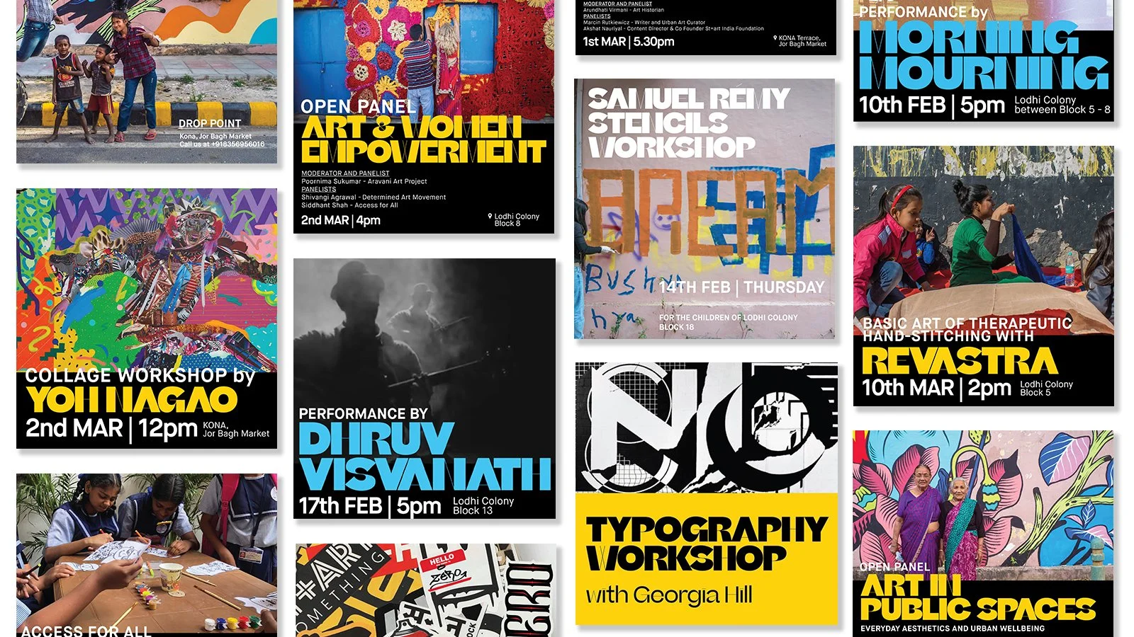
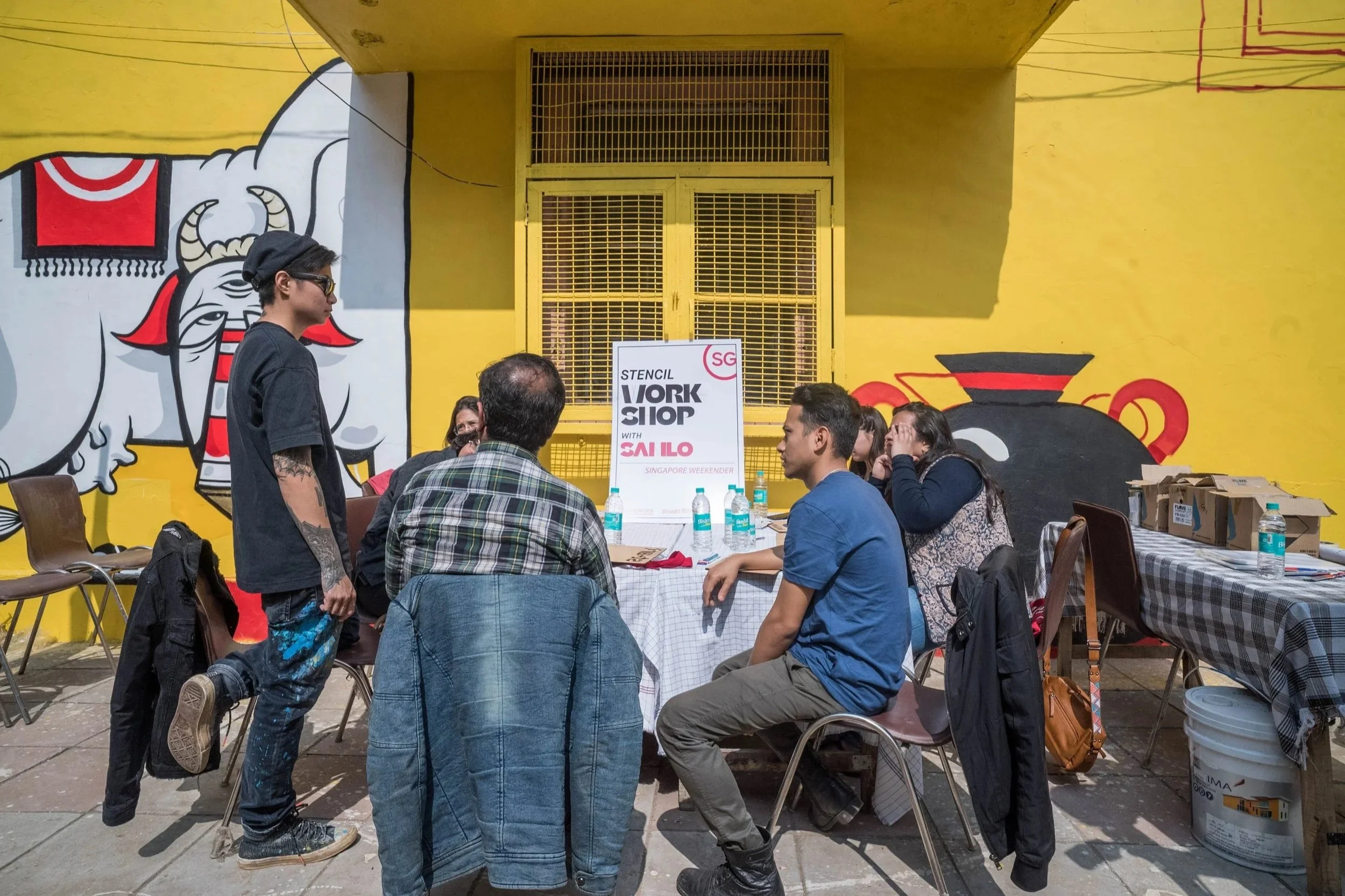
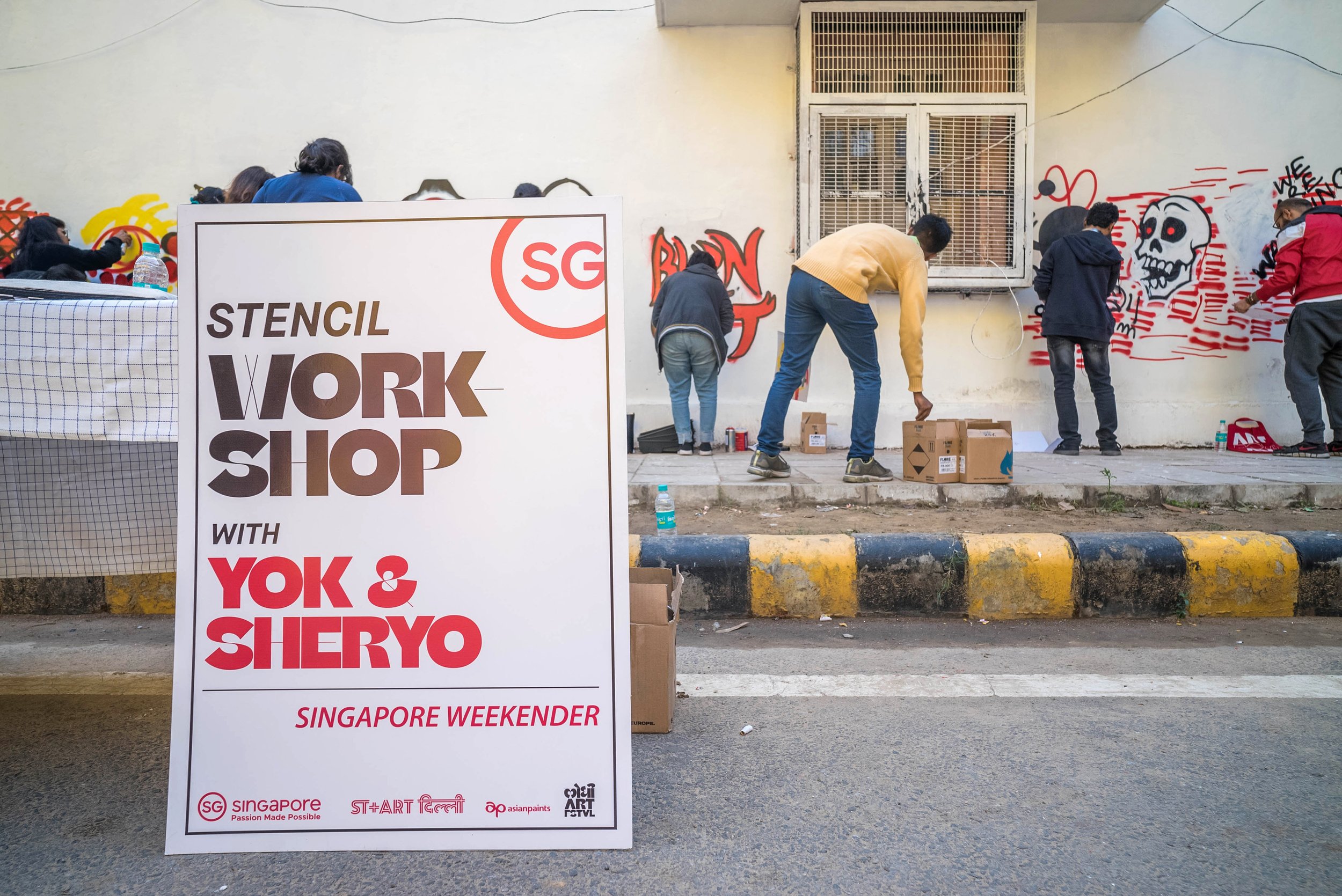
NEW DELHI, 2019Lodhi Colony is a non-gated government housing neighbourhood of 30,000+ residents in central Delhi. Built in the 1940s as a pedestrian-friendly, architecturally rich, and largely invisible to the wider city. St+art saw potential in its wide walls and walkable streets. The 2019 festival was the fourth edition: a 2 month public programme of 20+ new murals, performances, workshops, and panels which is free, open, and built around the neighbourhood as much as for it.
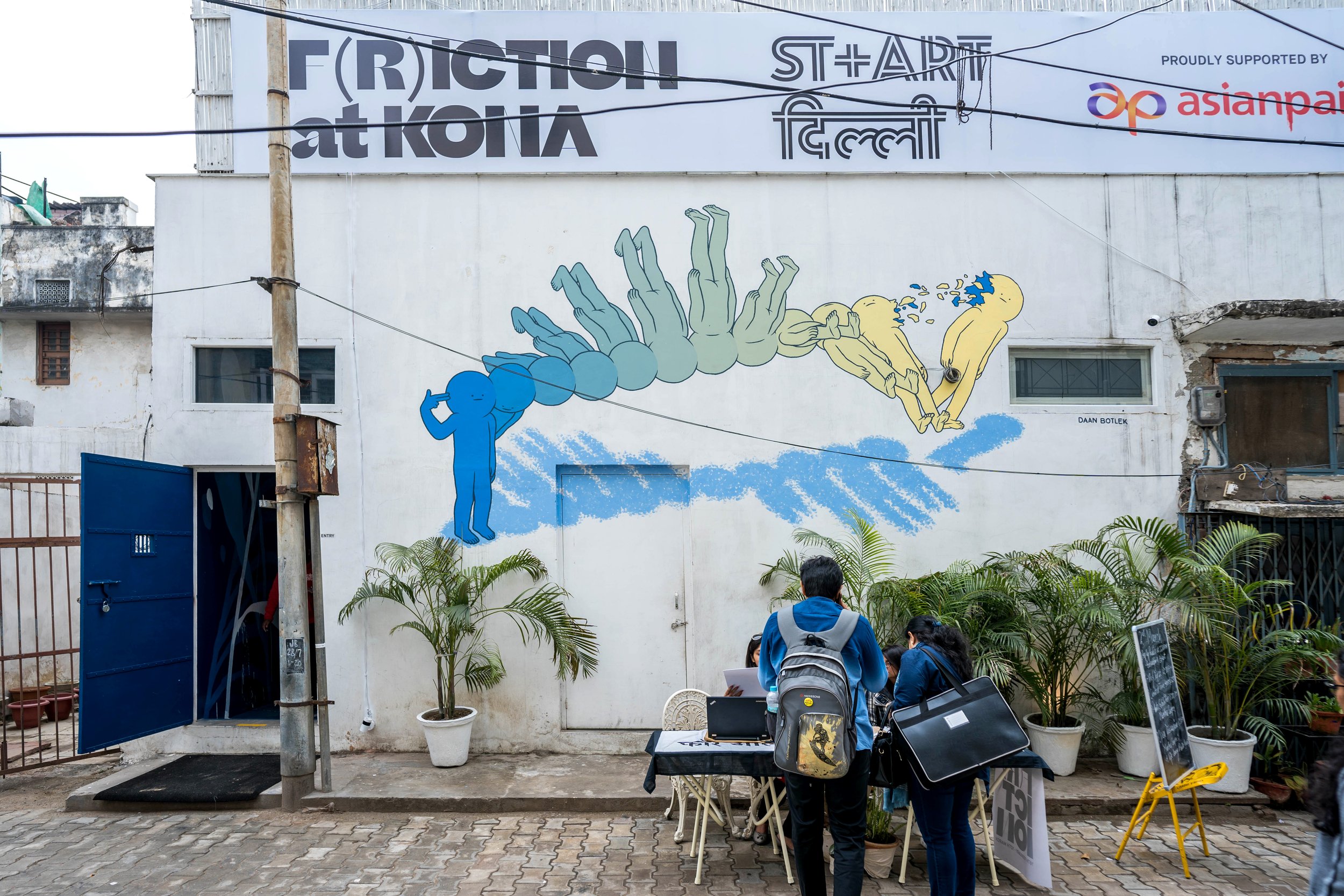
Running alongside was F(r)iction, a gallery exhibition in Jor Bagh, which brought in a more design and art-curious audience and gave emerging international artists a platform beyond the street.
15+ partners
Collaborations with Embassies & Cultural Institutions
50+ murals
by 2019, 4th edition
18k+ visitors
Avg. foot fall across 3–4 week festival run
DESIGN
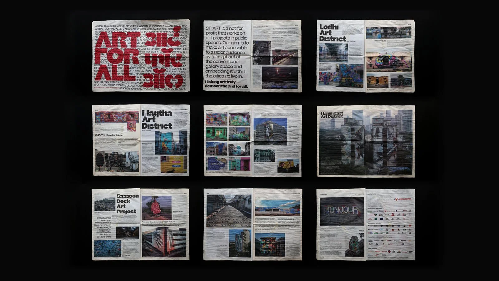
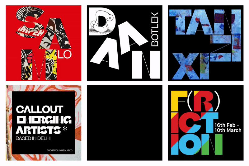
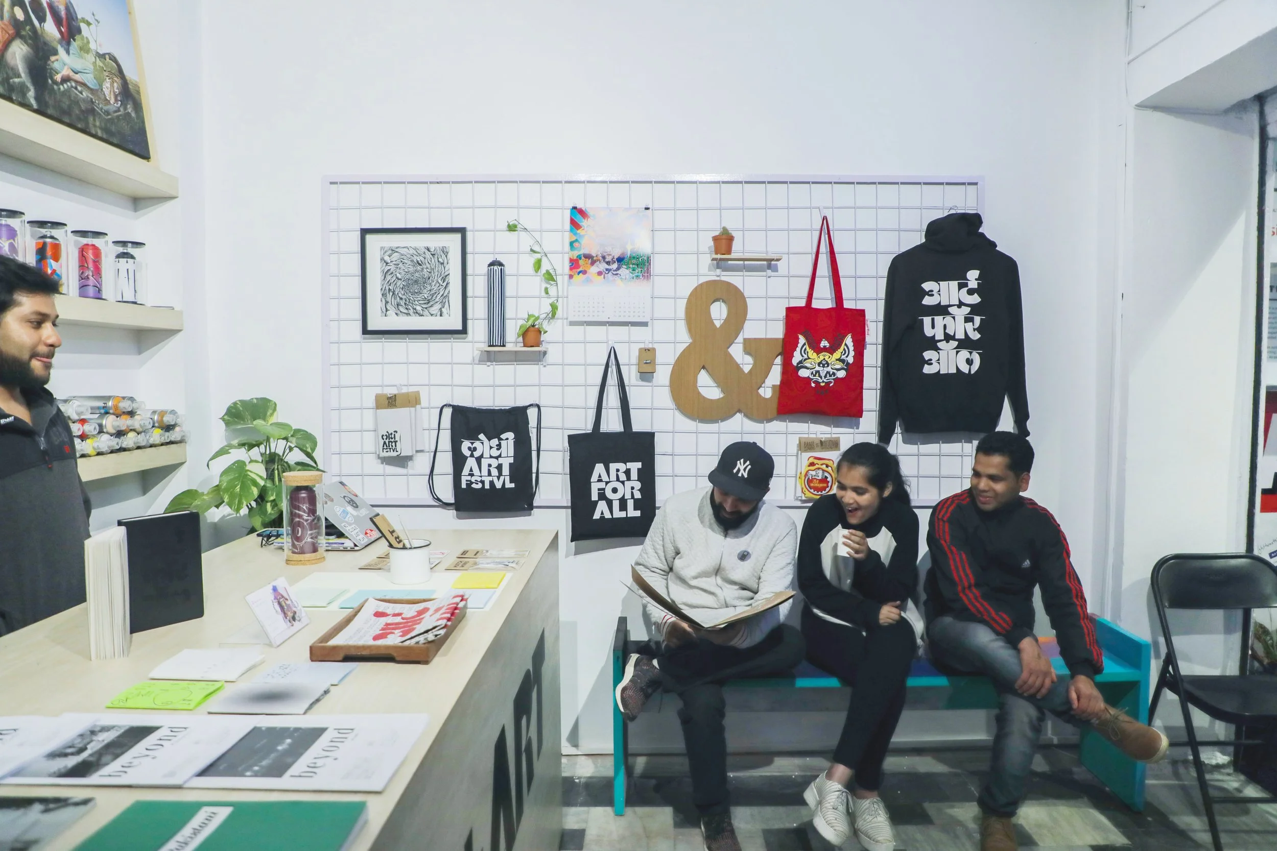
The identity had to span an unusually wide range of surfaces and hands simultaneously: 30m building facades, way-finding signage within the district, a printed broadsheet sold in the merchandise store, social media event templates, partner collateral, and an isometric neighbourhood map developed with architect Pierre Guyot for guided walking tours. Templates locked typography, spacing, and colour throughout so non-designers collaborators could access assets without breaking the system.
HIGHLIGHTS
Multilingual brand identity. The logo paired Devanagari script with a Latin typeface, with a custom glyph matched in optical weight and proportion. The word 'Lodhi' in Hindi was structural, not decorative. A claim that the festival belonged to the neighbourhood it was in.
Diplomacy through design. Partner collateral was produced for 15+ international cultural institutes and embassies including the Swiss Arts Council, Japan Foundation, Singapore Tourism Board, Polish Institute, and Italian Embassy Culture Centre, each requiring co-branded assets that held within the system without diluting it.
Art meets the street. F(r)iction, the parallel gallery exhibition, extended the festival into a formal space, blurring the boundary between public street art and curated contemporary practice, giving artists a dual platform and audiences a dual experience of the same work.
IMPACT
"We wanted to take art to the masses and make it accessible to a wider range of viewers. The idea was to open spaces for dialogues, conversations and culture creation through the lens of the city." - Arjun Bahl, Co-founder & Director, St+art India Foundation
Lodhi Art District was officially inaugurated on 1 March 2019 by the Director General of CPWD, marking it as India's first formally recognised public art district. The district has since grown to 65+ permanent murals. Brigitte Macron, Sophie Grégoire Trudeau, and Tim Cook have walked its streets.
"Currently, the Lodhi Art District stands as one of Delhi's main tourist hotspots, attracting dignitaries throughout the year."
- Vogue India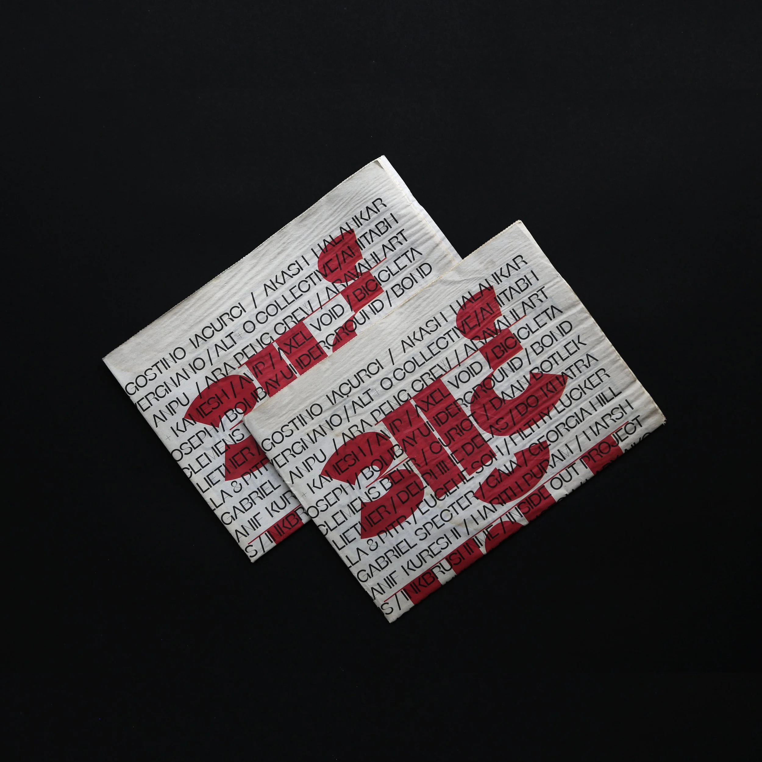
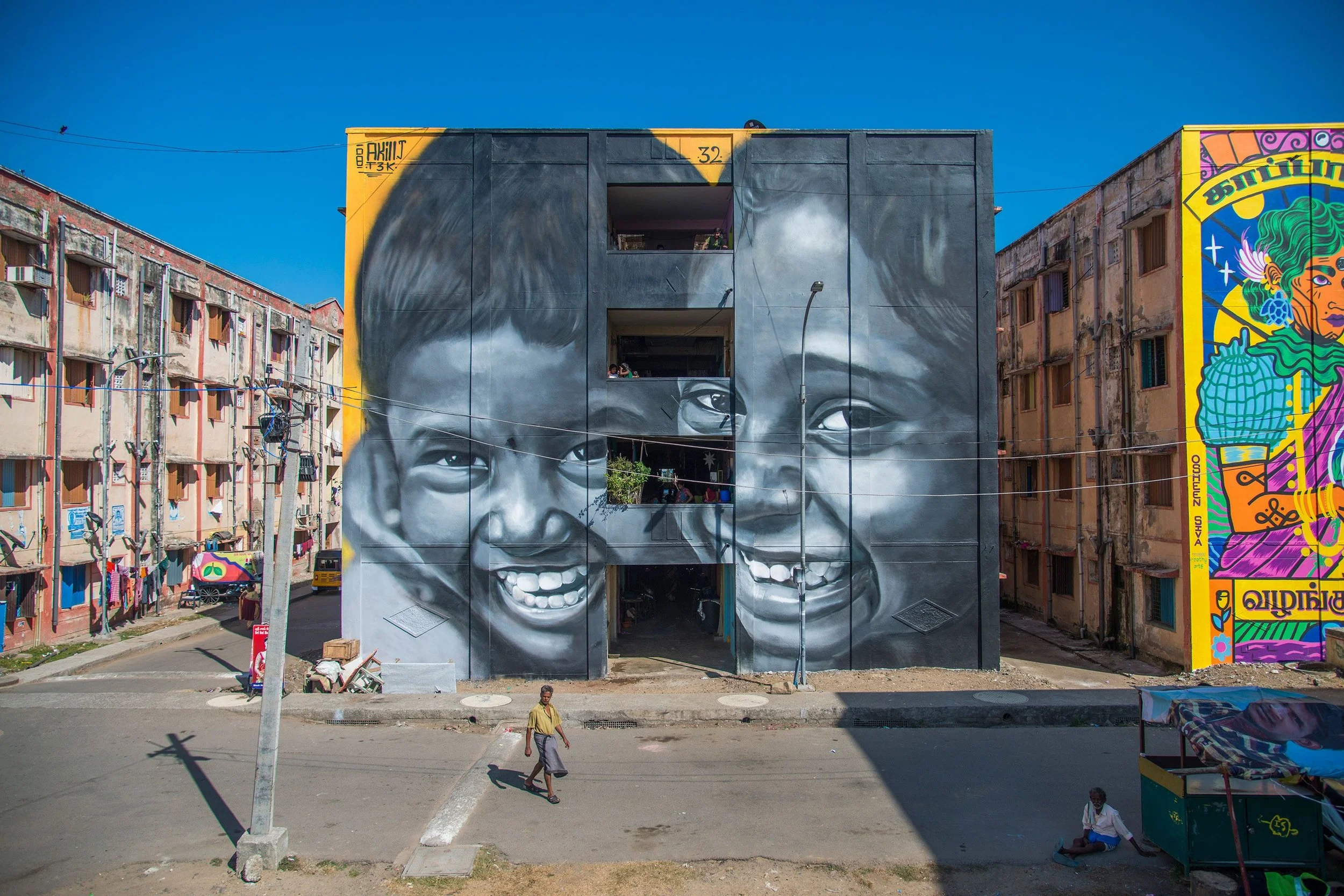
KANNAGI ART DISTRICT
CONTEXT: PLACE & PROJECT
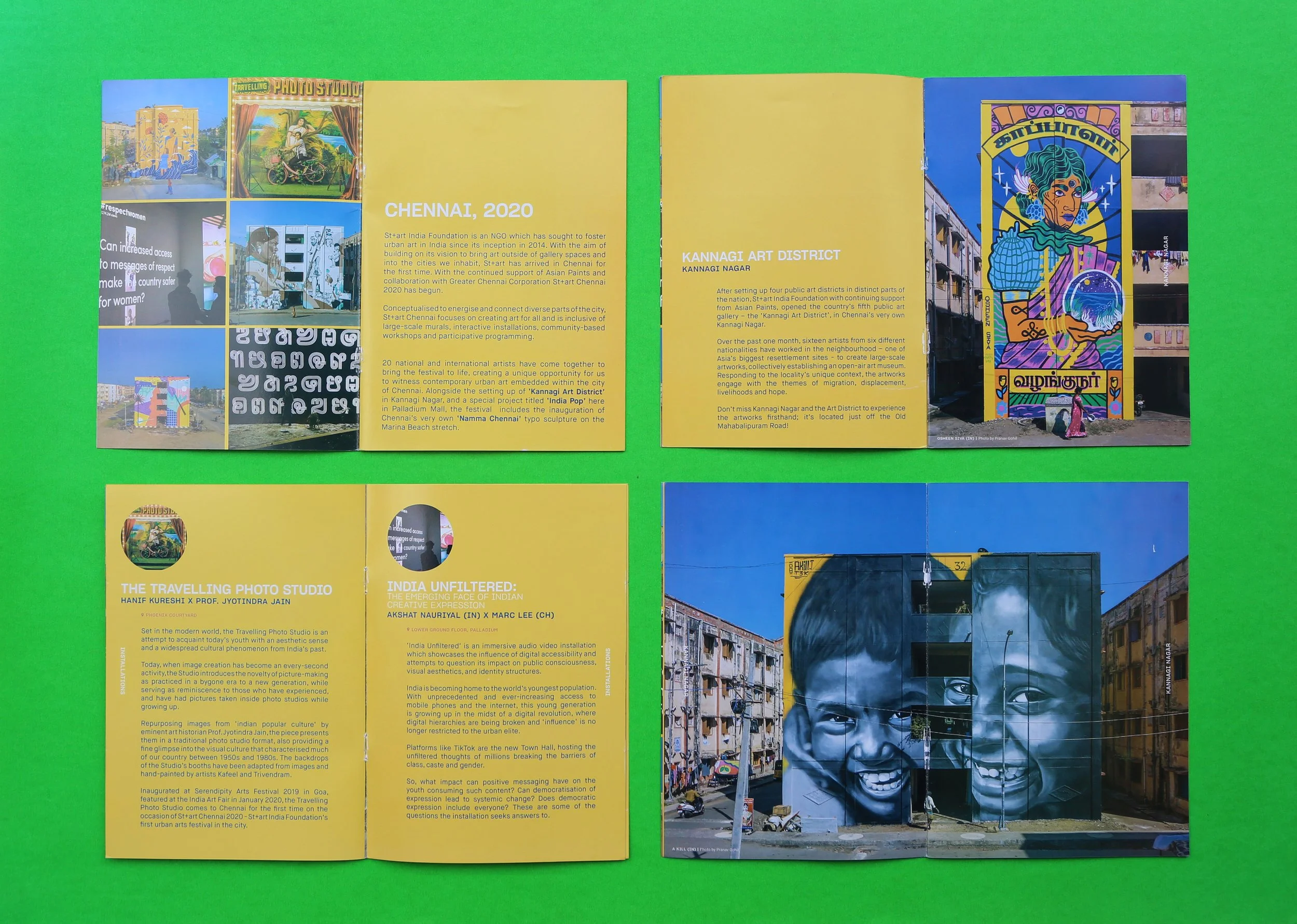
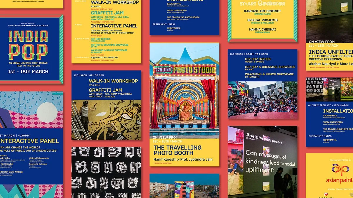
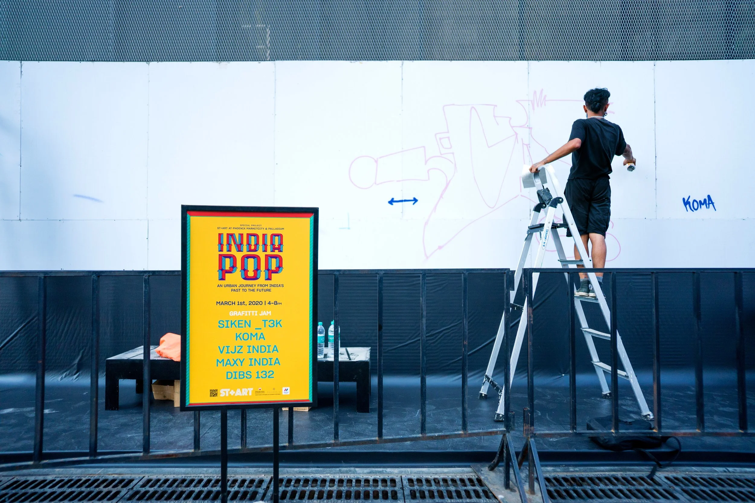
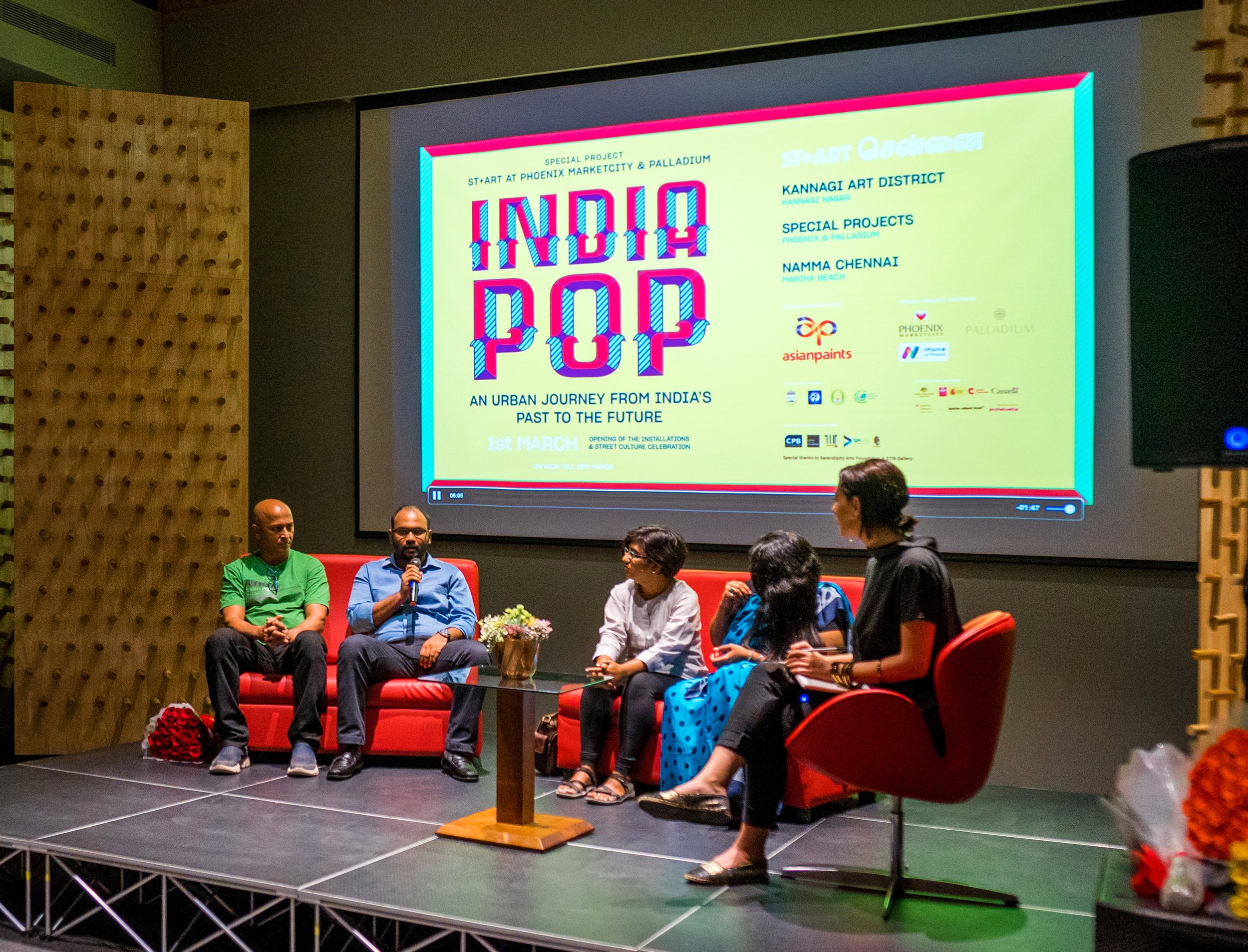
CHENNAI, 2020Kannagi Nagar is one of India's largest resettlement colonies, home to 80,000 people, many displaced by the 2004 Indian Ocean tsunami. The neighbourhood carried a stigma that had followed it for two decades. St+art, working with Greater Chennai Corporation (GCC), Tamil Nadu Urban Habitat Development Board, and Asian Paints, brought in 15 Indian and international artists to paint 16+ building facades, creating Chennai's first art district around the theme of People and Environment.
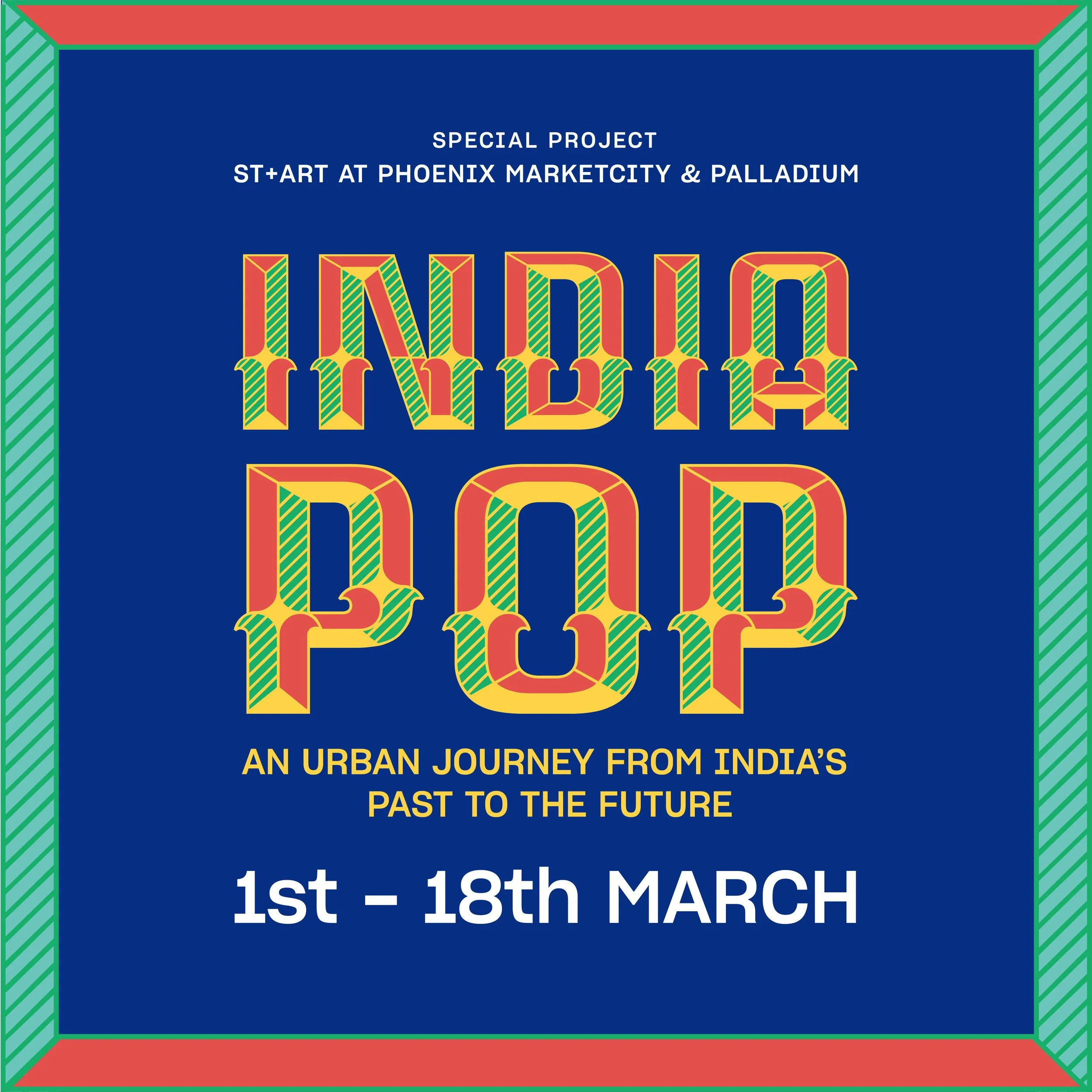
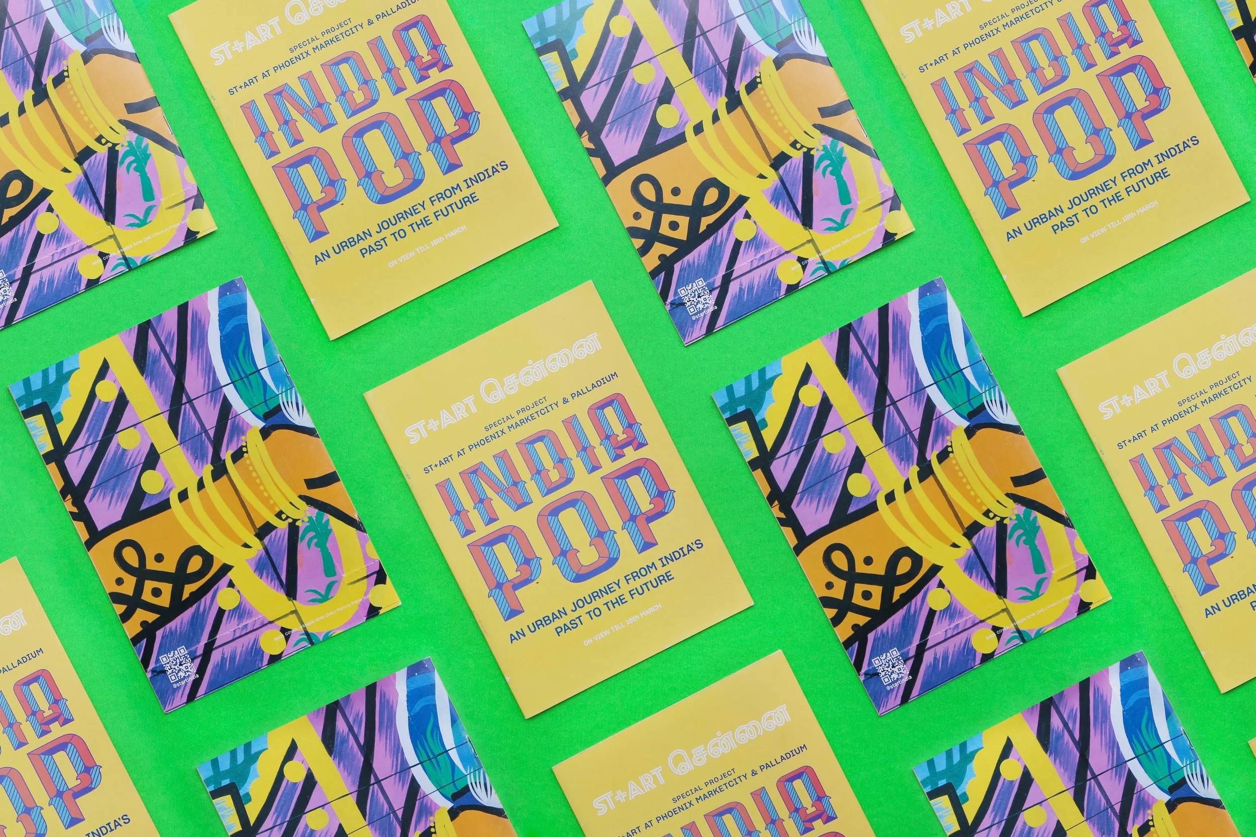
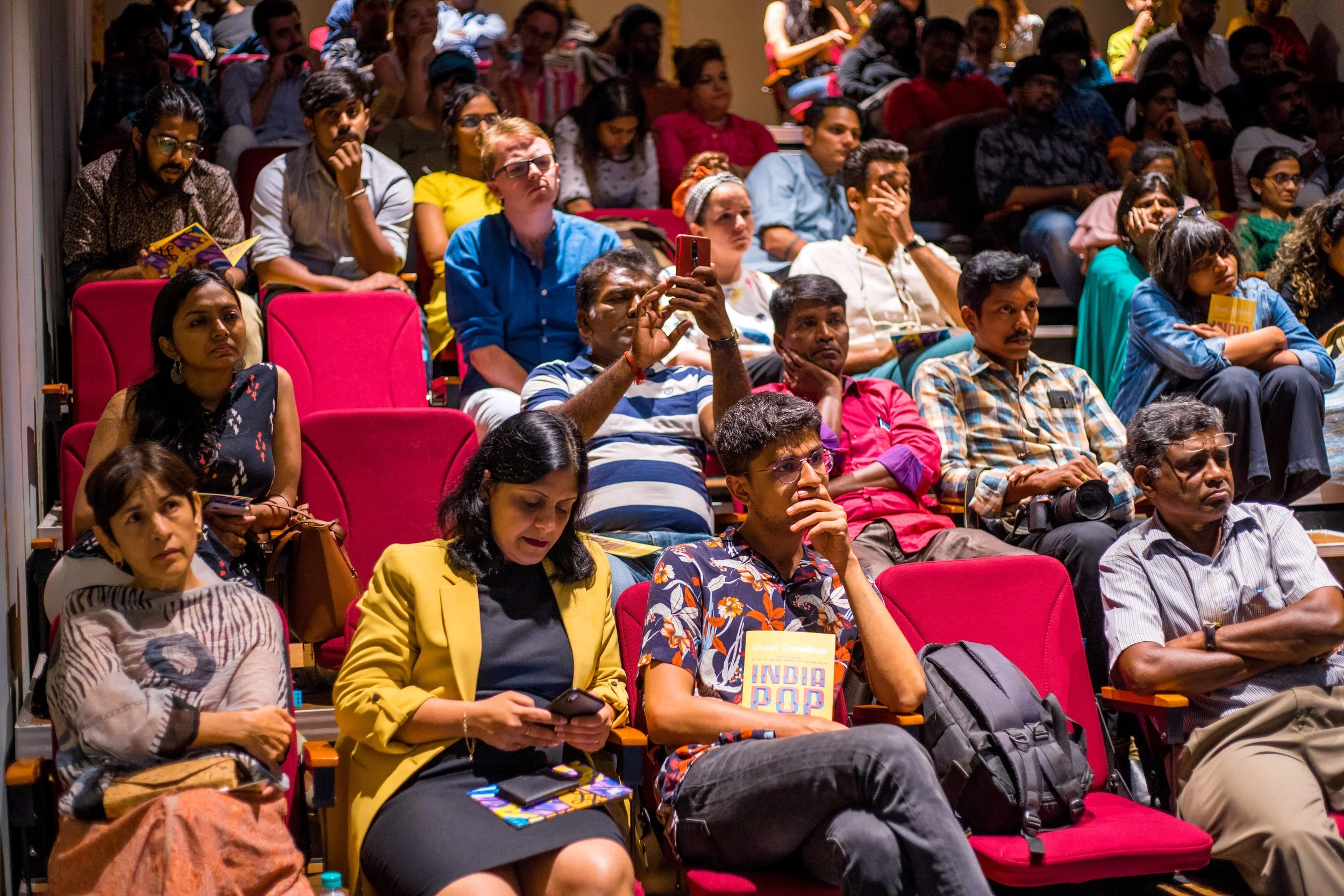
India Pop ran in parallel at Phoenix Market City and Palladium, a high-footfall commercial mall, pulling the district into conversation with a mainstream design-curious audience and giving artists a formal exhibition platform alongside the street.
16+ partners
including local government bodies & Institutions
20+ murals
after 3 editions
2k+ visitors
Avg. foot fall across festival run period
DESIGN
The identity worked across two simultaneous environments: the open-air district and the commercial mall, visually distinct enough to feel different but connected enough to read as one project. The mall context required clear information hierarchy to cut through a chaotic retail environment. The palette was pulled directly from the Kannagi murals, creating continuity between both spaces. Deliverables spanned environmental signage in the district, exhibition graphics, promotional print, and digital and social assets for the mall activation.
HIGHLIGHTS
Reviving a regional typeface. The identity used Painter Kafeel, a custom font handpainted by Kafeel and digitised by Whitecrow, putting a regional typeface back into contemporary practice. Tamil script was integrated structurally, not as translation appended at the end, in a city where that distinction carries real cultural weight.
Cross-institutional collaboration. The project brought together Greater Chennai Corporation, Tamil Nadu Urban Habitat Development Board, Asian Paints, Chennai Smart City Limited, Chennai Photo Biennale, and Urban Design Collective, each contributing programming, community workshops, or documentation alongside the visual identity.
Art as reputation shift. The design had to carry a social argument, not just a visual one: that a neighbourhood people were warned away from was worth travelling across the city to see. Every touchpoint, from district signage to mall posters, was part of making that case.
IMPACT
"For Chennai, Kannagi Nagar was chosen for its diverse community of 80,000 residents and because it has existed away from the urban fabric of the city. Chennai's Kannagi Nagar is the latest addition to their project which makes it India's 5th art district." - Homegrown, citing The Hindu
The project shifted how Chennai perceived Kannagi Nagar. Residents reported increased pride and connection. People who had never visited the neighbourhood began making the journey specifically to see the murals. The district has since run three editions, each inaugurated by Greater Chennai Corporation. Covered by CNN as a significant case of art-led urban regeneration in India.
“Our intent is to change the narrative in terms of how citizens of the neighbourhood and the city identify with Kannagi Nagar"
- Dr Alby John, Regional Deputy Commissioner, Greater Chennai Corporation.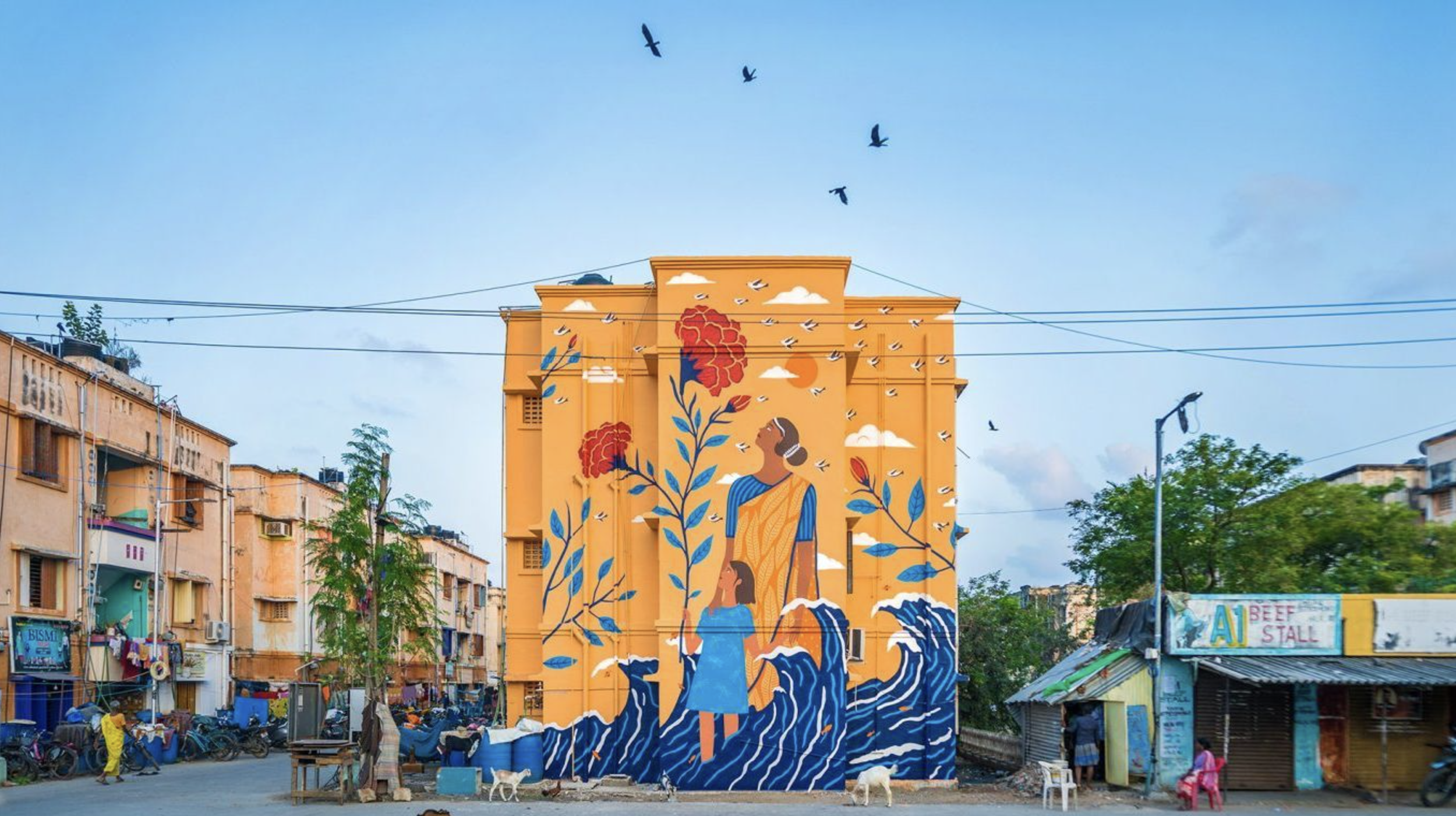

IMPACT
↑ 6 Art districts
co-created across India based on the Lodhi Colony model. Including Mumbai, Chennai, Hyderabad and more to come.
↑ 40% CSR budget
Asian Paints , lead sponsor across projects recorded their largest CSR spend ( $9M USD) and cited The Lodhi Art District as a milestone in their annual report.
↑ 60+ institutional collaborators
International embassies & cultural institutes as partners and growing soft & cultural capital and engagement across channels.
TAKEAWAYS
WHAT THIS WORK REALLY IS ABOUTArt as a common language
Through art districts, festivals, and public interventions, St+art has transformed urban landscapes across 25+ cities, creating meaningful engagements between communities, artists, institutions, and local governments.The design system has had to carry that across Hindi, Tamil, English, and the visual languages across script and context simultaneously. Language is a flexible element and adapted across each project.
Brand building as trust, not visibility
Asian Paints, as Vision Partner, describes their collaboration as "a long-term initiative dedicated to making public institutions more inclusive, welcoming, and emotionally responsive." The brand value here is not awareness. Its credibility earned by showing up in places and for communities that commercial sponsors usually don't reach. The designing for spaces and systems that outlast a single intervention or project.
A design ecosystem, not a single brief
St+art operates across a cluster of related entities: the foundation itself, XXL Collective (which executes commissioned and commercial projects the non-profit cannot take on), XXL Gallery (urban contemporary art brought into homes and the art market), and Guerrilla Art & Design (a multidisciplinary studio working across art, space, and typography). The design language built across these projects feeds into a broader visual ecosystem, where public art, commercial commissions, and gallery practice draw from the same talent and resources.